tinkl
tinkl
Improving a web app that helps find inclusive & accessible bathrooms
Overview
Product
tinkl is a bathroom-finder app that helps users locate bathrooms in the Twin Cities and surrounding areas, with the aim of helping trans, non-binary, and gender-nonconforming individuals find safe restrooms that they can use without fear of harassment. tinkl supports users in finding nearby gender-neutral and/or single stall bathrooms, see user reviews and comments, and leave their own feedback after using a facility.
Context
When I joined the project, there was a first design already live for tinkl, and the team was looking to develop tinkl 2.0 with new features. My goal was to determine a new feature that could add value to tinkl’s user base.
Goals
Evaluate the usability of the existing design and learn more about the needs of tinkl users to inform the prototype a meaningful change to the tinkl product.
Methods
Cognitive Walkthrough
Task Analysis
User research
Interactive prototype design
Research
Method 1 - Cognitive walkthrough
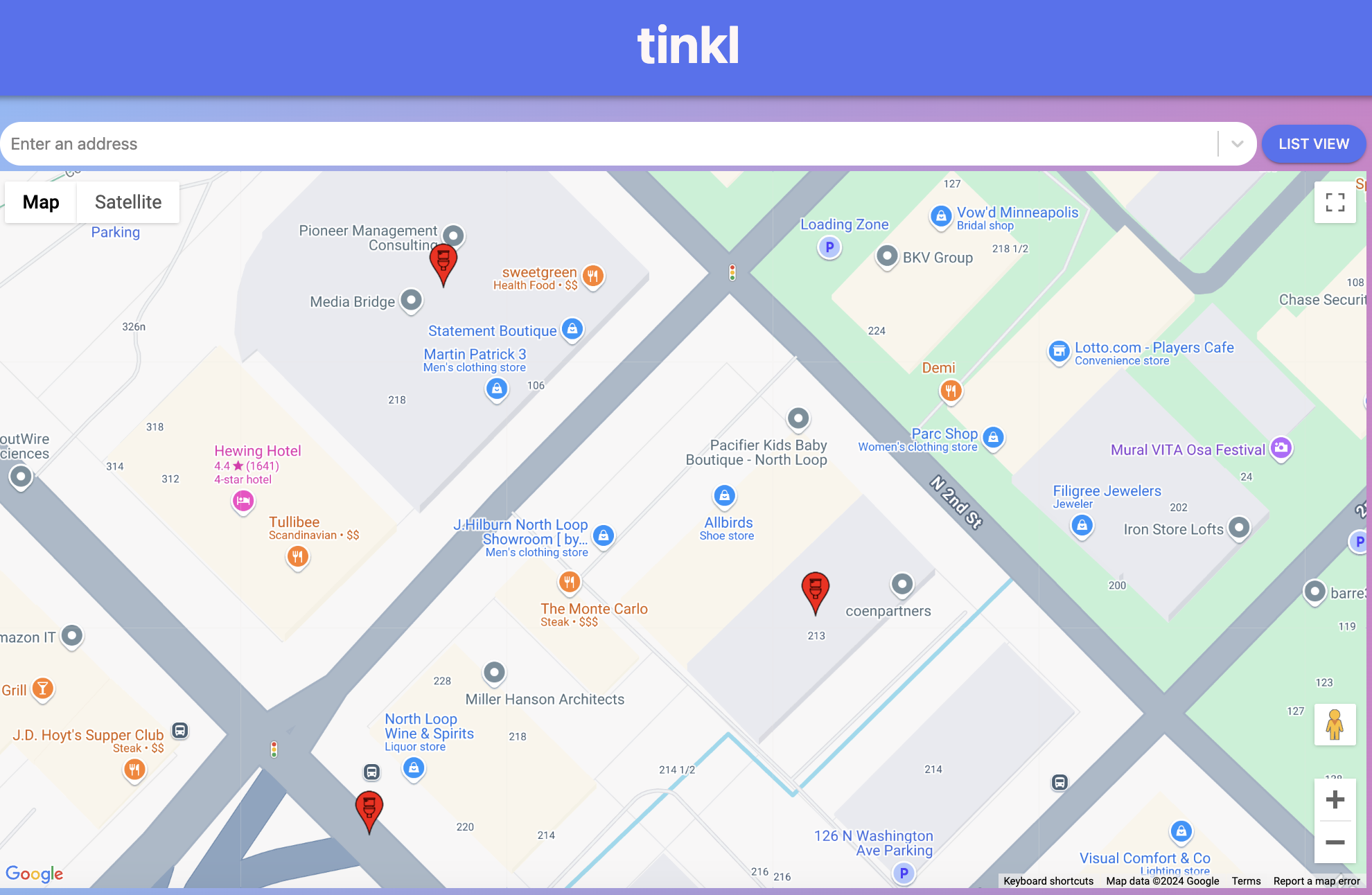
I started the research for the tinkl website with a cognitive walkthrough to try to get a first impression of the usability. I tested basic user tasks such as finding a bathroom, viewing user comments, and making a profile and checked to see if the controls made sense, noting recommendations to improve usability.
This prepared me for the guided interview, where I was interested to see how the user moved through the flow.
Method 2 - Guided interviews
User interviews were conducted with two users of tinkl. This included a user with special needs who uses a wheelchair and an eye gaze device. All users needed to find bathrooms ahead of time when out of their houses to make their lives more convenient.
Goals of the interviews included:
Seeing how clearly users move through tasks
Looking for which features to improve
Gaining insight into adding new functions
Results
“I will plan my day around my bathroom needs.”
The user with the eye gaze tool said that having larger fonts and information about whether bathrooms were wheelchair accessible and gender neutral earlier in the user flow would be helpful. This would make it easier for them to use the app without having to press too many buttons.
These insights informed my interactive prototype.
Interactive Prototype (see left)
For the interactive prototype, I redesigned the feature where users click on bathroom icons:
Changed the indicator icons from red location tags to purple bathroom icons (calmer color)
Simplified where in the flow the user can see the features of the bathroom:
Flow 1: Search bathroom > Click bathroom icon > Scroll down on bathroom description page > click out of window to view other bathrooms
Flow 2: Search bathroom > hover over bathroom icon to display bathroom’s features as simple icons
Changed the “click out of box manually” feature so that the mouse can just hover over bathrooms to display information.
This made the site more accessible to users with an eye gaze tool, because no clicking was needed and bathroom features were displayed in a simpler flow.
Learning and Next Steps
It was new for me to learn about bathrooms and accessibility in this context, and it was interesting to design with empathy for user groups with special needs. I was also surprised by the level of detail needed in designs to serve users with eye gaze tools - such as larger fonts and flows with less clicking.
tinkl adopted my feature of moving icons showing bathroom features to earlier in the user flow.
For next steps, I recommended introducing a star rating system for bathrooms (right now the bathrooms include comments, but not a rating that could be easily viewed).

